Q1:Compare the advertisement of a local brand in different language editions and demonstrate how semiotics can reveal the differences and similarities between them.
In this post, I will analyze a series of print advertisements by the local brand P1W1MAX.This is a campaign called 'Sudah Potong' released in the year 2010 and won a gold Effie in 2010 and both the Bahasa Malaysia and English TVC's won metals at The Kancils 2010.
Denotative meaning: 'SUDAH POTONG?', 'CUT ALREADY?', '你割咗未啊?' slogan with three different male models holding either grass shear, saw or scissors cutting the telephone wire.
Connotative meaning: This campaign advertisement is belong to the wifi broadband company P1W1MAX. This campaign is best know for its slogan as the meaning of the slogan insinuates circumcision in Malaysia. The actual message of the slogan and the visual is about to cut the wires, cut the charges and cut the lag as P1W1MAX offers high speed wifi broadband services.
This campaign was very successful and impressive as it caught the masses' attention when they first heard about the slogan either in Malay, Chinese or English language. Look at the print ad clearly, as I personally think the position of the telephone wire placed purposely around the lower part of the male models bodies to insinuates the concept of the slogan. In English and Chinese edition print ad, the first word of the texts below the models are the same however in Malay edition we couldn't find it's the same.
What is Binary Opposition?
A binary opposition is a couple of related terms or ideas that are opposite in meaning. Binary opposition is the system by which, in dialect and thought, two theoretical opposites are strictly defined and set off against one another (Schreuder, 2014). The concept of opposition emphasizes the fact that signs worth only in relation to other signs (Danesi, 2007).
This is a very interesting campaign that utilize the technique of binary opposition. This advertisement campaign, consider the 2006–2007 Apple Company campaign involving the “Mac guy” versus the “PC guy,” which was spread through television commercials, print advertising, and websites of all kinds (Danesi, 2007).
As you can notice the Mac guy dressed in very casual style which represent the notion of young, smiling makes the entire person looks friendly. The PC guy dressed in a suit and tie looks professional however his face expression looks dreary which represent old fashioned. Two of the characters give a completely different lifestyle. Obviously, the target audience will be the young generation (Danesi, 2007).
Reference:
Danesi, M. (2007). 'Why it Sells?' pp.22-23 [Online] Available at: https://books.google.com.my/books?id=L45WIXpB9ZkC&printsec=frontcover#v=onepage&q&f=false [Acessed:23th June 2015]
Schreuder, D.A. (2014). 'Vision and Visual Perception' pp. 33-34 [Online] Available at:https://books.google.com.my/books?id=I7a7BQAAQBAJ&printsec=frontcover#v=onepage&q&f=false [Acessed:23th June 2015]
After did some research through the past few weeks, I decided to do a checklist that refer
to some specialist sites that might be useful for my advertisement
analysis.
Key terms
Signifier and Signified
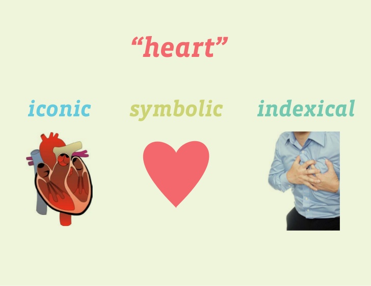
Symbolic, Iconic and Indexical
Connotation and Denotation
Paradigm and Syntagm
Myth
Intertextuality
Binary Opposition (Will be revealed in the next post)
Guiding question to frame analysis
What are the signifier, signified and symbol that appear in the advertisement?
What are the connotative and denotative meanings of the signs that used in the advertisement?
How is linguistic used in the advertisement?
What language devices offer information or create some expect for emotional response?
Does the advertisement exploit metaphor? Metonymy[1]? Repetition? Alliteration? Comparison? Contrast? Definitions?
What evidence of myth can be found in the advertisement?
What are the main visual images? How are they depict and what do they symbolize?
What product or service is being advertised?
What pragmatic strategies are being exploited?
How is the consumer positioned in relation to the text? Are
specific gender roles projected onto the consumer through the discourse
of the advertisement?
Definition:
[1] This kind of sign is something associated with something else, that then
represent that something else. Thus, in a postcard example baby
associated with the notion of future, and the baby is thus a metronomic
sign. (Rose, 2007)
References:
Taylor & Francis (2009). 'Language and Power: A Resource Book for
Studens' pp.140-141 [Online] Available at:
https://books.google.com.my/books?id=zZgRaxGfg6UC&printsec=frontcover#v=onepage&q&f=false
[Accessed 22nd of June 2015]
Rose, G. (2007). 'Visual Methodologies: An Introduction to the
Interpretation of Visual Materials' pp. 80-81 [Online] Available at:
https://books.google.com.my/books?id=gnUPNcnYjcIC&printsec=frontcover#v=onepage&q&f=false
[Accessed 20th of June 2015]
Creative Directors: Jeremy Craigen and Ewan Paterson
Art Dierectors/ Copywriters: Dylan Harrison and Feargal Ballance
Art Director: Nick Allsop
Copy Writer: Simon Veksner
Account Planner: Hannah Wren
Account Managers: Martyn Farmer and Jason Lusty
Photographer : Paul Murphy
Typographer: Kevin Clarke
Client: Volkswagen
Released Year: 2003
Denotative meaning:
The car advertisement has a linguistic message- text
that reads “Small but tough. Polo" as the brand single minded proposition. A visual image of the brand's logo. In the picture setting, there has cars and police officers at the street.
Connotative meaning:
From the advertisement image, we can see that police officers take refuge behind the Volkswagen's polo instead of using other cars/ police's car during a gun battle. Assuming that Volkswagen Polo is so tough to protect the police officers from attacking during a gun battle.
The signifier is Iconic of Volkswagen Polo. It signified Volkswagen Polo is so small but tough as there's a bunch of police officer refuge behind Volkswagen polo which is small instead of other long cars. The paradigmatic relationship in this advertisement shows
Volkswagen Polo is placing with other cars which looks old-fashioned. The indexical sign Volkswagen Polo looks stylish and stands out among the other cars. By using the narrative paradigm theory, it automatically puts those who own Volkswagen Polo to an unique consumer category as they're owning a special type of car.
Myth:
The ‘narrative’ or the ‘myth’ in this image is – if you own a Volkswagen Polo,
you will become protected, stylish and unique.
Reference:
Macleod, D (2008). 'VW Polo small but tough' [Online] Available at: http://theinspirationroom.com/daily/2008/vw-polo-small-but-tough-cops/ [Accessed: 16th of June 2015]
In advertisement, language and visual sign are not merely used to denote something but also trigger various connotations attached to the sign. These range of connotations, often called the connotative chain, connected with one sign create the Myth. (Lišková, 2012) In general, advertisements make use of myth, trying to attach mythic significations to products or services by taking up already meaningful signs. (Pull, 2014) This is how advertisements communicates the message that it is trying to portray to its viewers.
I will analyze an advertisement with basic principles including denotation, connotation and myth.
Credits & Description:
Creators
Copywriter: MAY WONG
Art Director: Maggie Leung
Account Supervisor: Agnes Chung
Advertiser Supervisor: Brendan Inns
Creative Director: RAYMOND CHAU
Photographer: TIM LAU
Typographer: Maggie Leung
Illustrator: Kamay Wong
Advertising Agency:
Creative Team:
Other:
The Print Ad titled CHILI was done by TBWA\Hong
Kong advertising agency for product: Shang Palace Restaurant (brand:
Shangri-la) in Hong Kong SAR China. It was released in the Feb 2001.
Denotative meaning:
- It's a restaurant's advertisement
- From the text that use in the advertisement, we know that the restaurant serves Sichuan dishes
- There are many chilis that form a burning firecracker
Connotative meaning:
- Hot spicy dishes that the restaurant serves can burn your tongue and explode your mouth as a firecracker
Myth:
- The dishes of Sichuan Cuisine are famous for their hot and spicy flavor.
- This advertisement emphasize that the restaurant serves the best and native Sichuan dishes which is hot and spicy flavor can burn your tongue and explode your mouth. I personally think that this advertisement is made for tourists as I know local people are really used to/good in eating hot and spicy food so this advertisement will not affect them at all. In contrast, tourists who want to try native Sichuan dishes will get influenced when they saw this advertisement.
Reference:
Lišková, D. (2012). 'The Visual and Lexical Components of Advertising' [Online] Available at: digilib.k.utb.cz/bitstream/handle/10563/19743/lišková_2012_bp.pdf? [Accessed: 12nd of June 2015]
Pull, M. (2014). 'Myth in Adverts' [Online] Available at: http://maaikepull.blogspot.com/2014/01/myth-in-adverts.html [Accessed: 14th of June 2015]
Signs are both denotative and connotative as I mentioned it in my previous post #3.
Denotative meaning: Literal descriptive meaning or the surface meaning.
Connotative meaning: Connotation relies on cultural or historical contexts, contexts of both the image and the viewer. The deeper meaning or association.
In semiotics, denotation and connotation are terms depicting the
relationship between the signifier and its signified, and an analytic
difference is made between two types of signified: a denotative
signified and a connotative signified. Implication includes both denotation and connotation (Chandler, n.d). The connotative meaning represents the complete message about the significance of the product or service which the advertisement is creating by the utilization of image (Džanić, 2013).
This is a perfume from Dior. “Dior J'Adore” a perfume for women.
Denotative meaning:
- The background/ overall colour tone is gold
- A beautiful model/ celebrity
Connotative meaning:
- Gold represents luxury and classy
- The model is a well known actress call Charlize Theron which also portray the perfume into an elegant and graceful image
- The model poses confidentially and gracefully in the middle that portray as a replica of the perfume's bottle
- Confident look of the model represent that she can be in the spotlight or become the focus of the attention. She's displaying in a gold dress. (e.g occasion like cocktail party)
From the visual of the model, I believe that this product is targeted to women or lady and not for teenager. This advertisement promotes the scent of the perfume can enhance women's confidence that they can stand out among others.
References:
Chandler, D. (n.d). 'Semiotics for Beginners' [Online] Available at:http://visual-memory.co.uk/daniel/Documents/S4B/sem06.html
Džanić, M. (2013). 'The semiotics of contemporary advertising messages:
Decoding visuals' [Online] Available at: hrcak.srce.hr/file/165534 [Accessed: 12nd of June 2015]
In this post, I will write more detail about pragmatic and syntactic which is a pair of ideas characterized by Saussure in regards to the relations of signs.
Definition: Syntactics: Relations among signs in formal structures
Paradigmatic: Relation in the middle of signs and the impacts they have on the individuals who use them
Advertiser generally create meaning in the advertising by using the notion of syntactic and pragmatic. Saussure initiated two ways of creating meaning: syntagm and paradigm.
Syntagm
The syntagm is creating implication by ordered combination of interacting meanings, by their connecting to the sign before or after them - by their order (Wejher, 2015).
According to Wejher's writing, by changing the word order in advertising can totally change the meaning. For example, considering a sentence 'nothing is impossible' that has been widely used, which means that everything is possible, there is nothing which can not be done.
If the word order was changed, it would mean something completely different. For example, impossible is nothing.
"Impossible is Nothing" is adidas' one of the biggest brand advertising campaign. This campaign has integrated television, print and outdoor
advertising, point-of-sale and Internet. The intention of the slogan 'Impossible is nothing' was to let audience know what obstacles and impediments from various perspectives such as social, physical, and mental. Through the campaign's stories, Adidas reminds athletes and
non-athletes that they can change the possibility from impossible to possible (Adidas Group, 2004).
The meaning "impossible is nothing" from the campaign is simply means regardless of the fact that a specific challenged is said to be impossible, that should be nothing to a man who is moved by that challenge. The slogan is take from the quote below.
“Impossible
is just a big word thrown around by small men who find it easier to
live in the world they've been given than to explore the power they have
to change it. Impossible is not a fact. It's an opinion. Impossible is
not a declaration. It's a dare. Impossible is potential. Impossible is
temporary. Impossible is nothing.” - Muhammad Ali
Paradigms exploit replacement of one or few words in a given sentence to change its meaning (Wejher, 2015).
For example, each of the words that placed vertically can be exchanged with a number of other words without changing the basic syntactic arrangement.
I can't think of any good advertising example of paradigm so I will just simply get an example from Wejher's journal.
There is an example of a paradigm in a Polish slogan of an advertisement about a television channel called TVN. "TVN here and here" was their previous slogan which simply means that it was available on both television and in the internet. Later the slogan was changed to "TVN everywhere", which means that television was available everywhere, in the north or south. By utilizing paradigm, that is using alternatives in the same position in their slogan, advertisers changed its implication and made their product more accessible and attractive (Wejher, 2015).
Reference: Adidas Group (2004). 'Impossible is nothing" adidas launches new global brand advertising campaign' [Online] Available at: http://www.adidas-group.com/en/media/news-archive/press-releases/2004/impossible-nothing-adidas-launches-new-global-brand-advertising-/ [Accessed: 5th of June 2015]
Wejher, M.B (2015). 'The Central Role of Language in Semiotics of Advertising' [online] Available at: skemman.is/stream/get/1946/20404/.../1/Malwina_Barbara_Wejher.pdf [Accessed: 5th of June 2015]
In this week's lecture class, one of the content of visual culture is seeing with semiotics and it's related to the essay topic that I've chosen.
Q1:Compare the advertisement of a local brand in different language
editions and demonstrate how semiotics can reveal the differences and
similarities between them.
Firstly, I will explain what is the term 'semiotic' means in this post.
Semiotic also known as 'semiology'. Semiotics is the study of signs and signifying practices. A sign can be characterized as any substance (words, pictures, objects, etc) that refer to something else. Semiotics indicates how the relationship between the sign and the 'something else' results from what our general public has taught us. Semiotics is concerned with the way that the reference is neither unavoidable nor important (Curtin, n.d).
Sign consists two component that can not be separated which are signifier and signified. Signifier represents its "form", while the signified represents the idea the sign expresses.
This three modes have diverse levels of conventionality, predictability and conformity. For instance, symbol such as letters and numbers are normally very common yet they can be easily understood.
Iconic signs generally have some level of conventionality, and indexical signs, depending on Peirce's compositions, can direct the attention to their objects by blind compulsion (Lanir, 2013).
Reference:
Curtin, B (n.d). 'Semiotic and Visual representation' [online] Available at: www.arch.chula.ac.th/journal/files/article/lJjpgMx2iiSun103202.pdf [Accessed: 2nd of June 2015]
Lanir, L (2013). 'Charles Sanders Peirce: Symbilic, iconic and indexical signs' [Online] Available at: http://www.decodedscience.com/charles-sanders-peirce-symbolic-iconic-and-indexical-signs/23013 [Accessed: 3rd of June 2015]
After pondering and discussing with some of my friends, I decided to go for Question no.1. I personally think that advertising has get to be intriguing to study as it approach an extensive variety of disciplines such as semantics and media studies.
Q1:Compare the advertisement of a local brand in different language
editions and demonstrate how semiotics can reveal the differences and
similarities between them.
Advertising has become integral part of our life, advertising is everywhere around us. The advertising industry today is showing an adjustment in the
traditional media to include the digital media such as mobile and internet in order to reach
audience more effectively.
Malaysia is a multiracial and multicultural nation, with Malay, Chinese, Indian and various indigenous individuals living next to each other. The choice of a fitting dialect for advertisement is essential to deliver messages to the consumers. Despite the fact that English may be commonly used in our country, speaking and using a local languages may make an impressive difference.
Reference:
Cobos, H.U (2013). 'Advertising and language the power of words' [Online] Available at: http://morethanbranding.com/2013/02/12/advertising-and-language-the-power-of-words/ [Accessed: 29th of May 2015]
In this module, I’ve been given 6 questions to choose for writing an essay by this semester. After looking through all the questions, I narrow down to two questions to do further analysis and exploration.
Question 1: Compare the advertisement of a local brand in different language editions and demonstrate how semiotics can reveal the differences and similarities between them.
Task Words - Compare and demonstrate Main Topic - semiotics Subtopic + Related Topic- semiotic, advertisement Parameters/ Limits - Minimum 1 Keywords- semiotics, advertisement, local brand, different language edition, differences and similarities
As a advertising and graphic design student, this topic can never go wrong. Firstly, it's highly possible to find a local brand's advertisement that interpret into different language editions owing to our country's cultural values and environmental factors. In some way, this might be one of the strategies of communication to target at certain racial groups. With one advertising design, multiple different languages are proposed seem to be more effective to reach target audience.
Question 6: Critically examine the popular usage of digital cameras, Photoshop, or Instagram, and its impact on professionals in the creative industry.
Task Words - Critically examine Main Topic - The popular usage of digital Cameras, Photoshop or Instagram Subtopic + Related Topic- Impact on professionals in the creative industry Keyword- technology
I'm interested in this topic and I know many of my course mates do as we're familiar with all kind of the technology that stated above. We know that technology is giving a huge impact in our society. I believe that this kind of technology is giving specific benefit to the professionals. Creative industry has come rely on technology, technology like adobe, allow creative people to be more efficient and reach beyond the usual. Adobe is becoming a services company to better connect the creative process and help people create in new and profound ways.
Reference:
Belsky, S. (2015). 'State of the creative industry' [Online] Available at: https://www.linkedin.com/pulse/20140325102257-4074853-state-of-the-creative-industry-its-democratization-benefits-us-all [Accessed: 27th of May 2015]